


TLDR:
I designed a logo, custom packaging, and sourced and managed overseas manufacturing to help launch a clients very successful boutique chocolate company.
The Challenge
Convince consumers to pay twice as much for 20g less chocolate per bar, for a type of chocolate (bean-to-bar) they’d never heard of before.
Context (a lesson in chocolate)
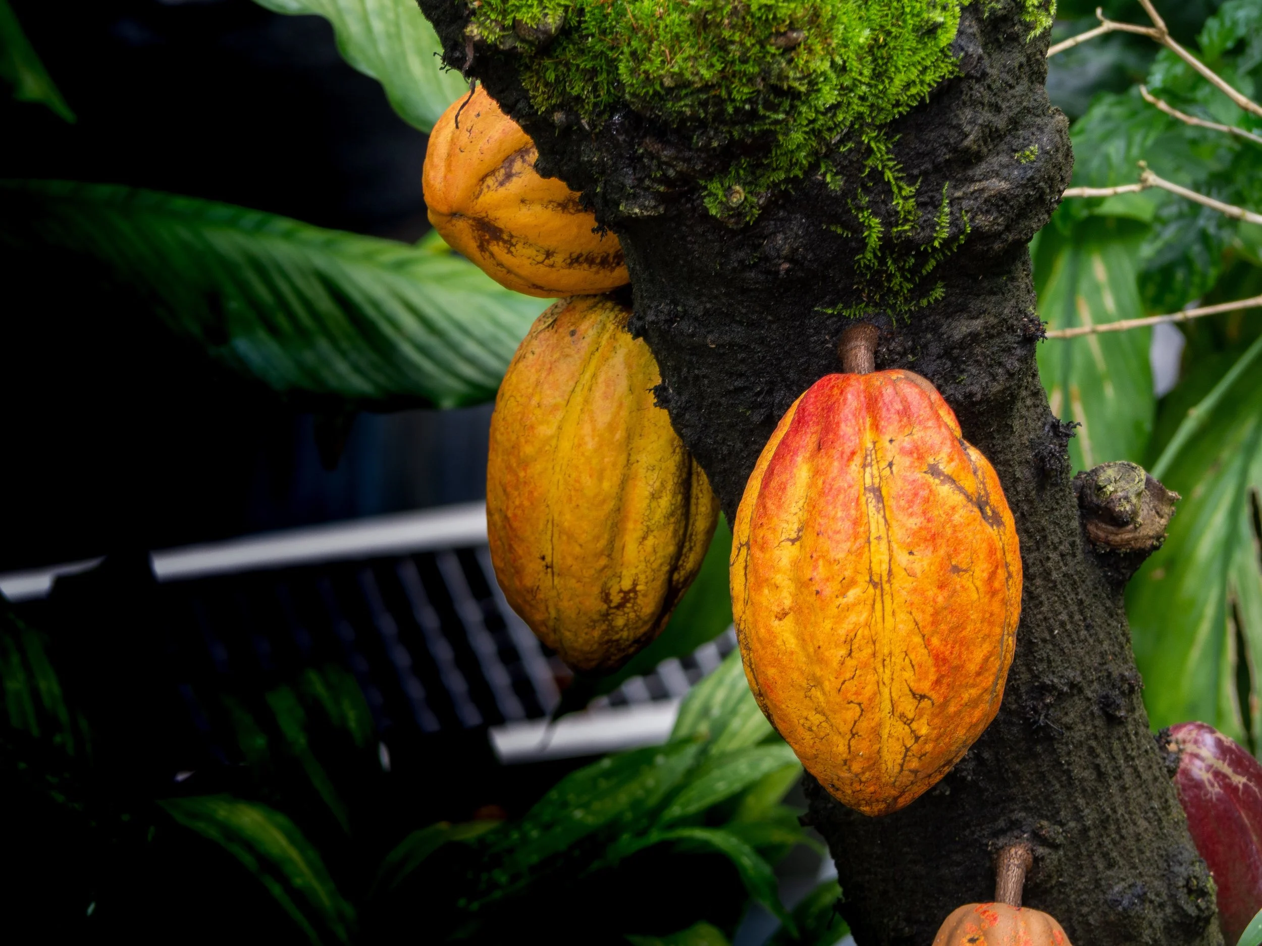
Most chocolate we know comes from couverture, a mass produced dark-roasted-into-conformity chocolate which is flavoured with vanilla and then sold to chocolatiers who re-melt, re-package and re-sell it. The taste we associate with dark chocolate? Vanilla.
Meanwhile, bean-to-bar chocolate differs from mass produced chocolate in that cacao beans are carefully roasted in small batches from localized regions. Like wine, the taste differs region to region and farm to farm — yes, chocolate can taste like strawberries or citrus.
But it takes a lot more work. So brands have to sell less of it for 2-3 times more, and simultaneously educate the consumer about the entire process. Like craft coffee, or brewhouses, once the consumer understands how to taste the product they’re sold and never go back.
The hard part is convincing them to pick it up.
What I did
I designed a logo that paid homage to 1920’s package design. I.e. channel trust and nostalgia into the first impression.
I then systematically opened and ate a disturbing number of boutique chocolate bars to begin the package design.
Package design constraints:
Avoid false promises; i.e. small chocolate bars in big boxes.
Non-negotiable chocolate thickness to get the right ‘snap’ when biting into the bar.
Shape and texture of chocolate, foil wrapper and outer package must compliment each other.
Playful and non-destructive; i.e. open and closable.
Quick to assemble.
Avoid plastic, but remain food safe.
Budget per wrapper (outer material + inner foil) under $2.
Final product
From the outside in, every step of opening the bar had to build trust and reward the decision to pick it up despite the higher price, smaller size and weight.
A square shape was chosen. This let the chocolate bar retain the correct thickness for biting into. The square also looked wider and thicker than rectangular competitors which were displayed standing vertically. Instead of competing side-by-side and looking less substantial, the shape completely destroyed the ability to compare volume and weight visually.
To solve the hardest problem, a playful non-destructive opening and closure system, we designed a briefcase style square box with an external flap that could be closed by winding a string around a copper riveted card stock button. For timeless class, rather than haute couture luxury, a gold foil logo was de-bossed (pressed in) into a custom textured 250gsm kraft paper.
Upon opening, in homage to Willy Wonka, we sourced a high end, thicker, textured gold foil wrapper to wrap the chocolate.
Finally, the chocolate mold chosen created a geodesic surface design. This created surfaces with higher and lower points than a flat bar, meaning, the shape could be stretched into a larger (thinner overall) square while still seeming thick.
Results
The quality of the chocolate matched the branding promise and completely changed consumer expectations of what chocolate could and should taste like. It sold as fast as it was made — the trust and education barrier had been overcome.
The brand was so successful it was acquired.