
Together

Problem
American’s average 4+ hours per day on a phone.
Solution
Calm notifications when spending time together.
What I did
TLDR: I was the principal UX designer for this case study. I conducted heuristic analysis’ of competition, did primary and secondary research, made affinity & empathy maps, personas, ran card sorts, screener surveys, interviews, created mood boards and style guides, wireframes & wire flows, did guerrilla user tests, made prototypes, wrote copy, made low and high fidelity mockups, and ran two rounds of usability testing.
What I learned: Users operate within a comfort zone —if pushing a new concept, keep the UI familiar.
Context
Screen time has birthed some unforeseen consequences. For example, phubbing (snubbing a person in favor of your phone) is linked to depression and alienation in relationships. It’s also linked to a lack of sleep, persistent issues with inattention and behavioural problems in youth.
In a University of Virginia study, 1 in 10 people surveyed even admitted to checking their phones during sex.
The caveat? Most research agrees screen time is ok in moderation (less than 1hr per day).
Methodology
There are a lot of apps and OS features that limit notifications and screen time. But, almost all of them require active participation. Meaning, users have to turn on focus modes, set timers etc.
This, despite research showing 31% of users phone time is attributed to problems with self control.
To learn more I sent out a screener to people aged 18-65, who owned a smartphone and who had downloaded one app in the past month.
Of the 26 respondents, 80% spent 3-4 hours a day or more on their phone, and 78% wanted to use their phone less.

Responses from initial screener survey
I then interviewed 5 respondents.
Interviewees all blamed screen time on work email and social media. Most employed screen time coping strategies that worked to a varying degree. I.e. using airplane mode, turning phones to silent, do not disturb, focus modes, physically turning phone upside down or moving it to another room.
But three other common issues which were more subtle emerged:
1. Respondents did not know what to do with their time; especially when alone.
“If I wasn’t on my phone, what would I do with that down time? I don’t know.”
2. Respondents acknowledged spending time on their phones in social situations.
“I use my phones in social situations almost 100% of the time”
3. Respondents really don’t like when those they have relationships with (family, friends, partners) go on their phones when they are together —even if they do it themselves.
“When someone pulls out their phone I feel disrupted and insulted”
Redefined problem
We need help moderating screen time, especially when with those we care for
The interviews helped define a persona that wasn’t several people, but one person that represented a homogeneous group.
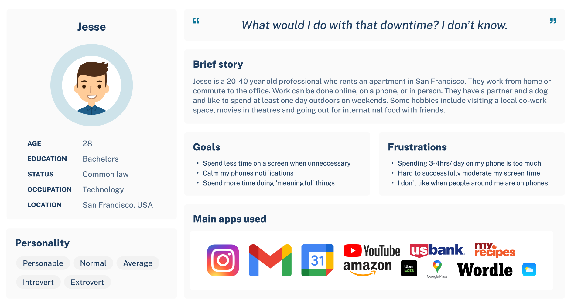
Jesse, the homogeneous persona
Ideation
To combat screen time I originally ideated an app that could do three things:
Set up geofenced locations (using a cool AR onboarding process) to limit work notifications at home, and home notifications at work
Customize all notifications received depending on a phones location
Gamify screen time with challenges and statistics

Wire flows for initial geo fenced augmented reality based notification blocker

Initial sketches for gamification
Initial mood board.
Unfortunately, guerrilla user testing led to the discovery that this design choice was too complex. Choices had to be simplified and notification calming made more passive. Which led to the idea of a proximity blocker.
Instead of physical coordinates, what if the other user was the geofence? A proximity blocker.
At its most basic, when one app user walks up to another they’re connected with, all default notifications cease for both of them. When their phones move away from each other, notifications filter through again.
Notifications can be customized by app, but by default all notifications are blocked except calls and texts (never blocked). Because as one interviewee put it:
“No one’s going to Snapchat me that the dog died, but I still want to be available for emergencies.”
The MVP proximity blocker for the Together app addresses phubbing other people, and being phubbed, but intentionally leaves alone time alone —for now.
Forward looking iterations may address alone time by prompting users towards self identified ‘more meaningful’ activities, but Together doesn’t ever aim to police alone time.
Together’s goal is instead to help us avoid mucking up our social settings and our time together.
Usability tests
Round One, 4x testers
The first iterations of Together were lean (no onboarding flow, just a sign in page). I learned that without enough initial friction during the setup and onboarding phase, users were unsure how the app worked or what it did. Consistent, concise and explanatory subheadings were needed on almost every screen.
Users also wanted more confirmation. Confirmation they’d deleted a contact, set a distance, etc.
Round Two, 5x testers
Unexpectedly, improving the onboarding flow with fun animations and explanatory copy took away from the first impression of the home screen —making it feel flat and lifeless.
Users also struggled to navigate unique number pickers.

Onboarding screens developed after the first round of user testing
Prototypes
Result
Proximity based notification management app. Show hi-fidelity samples here.
Fin.